The Backstreet Wall
- Thread starter Ruru
- Start date

Still, the candy one is nice xD
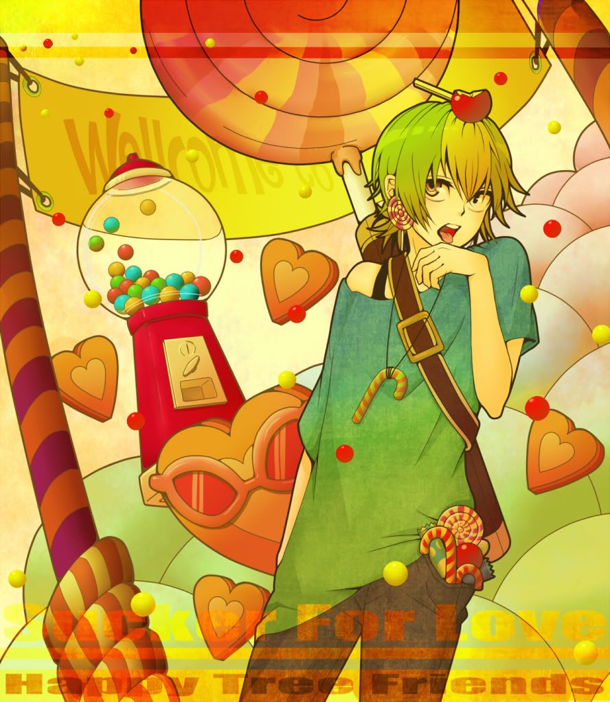
I like the first version of the candy icons better, cause the text seems kind of forced in the second version (At least in the first and second icon of that set, the third one seems ok) >__<"
The stand-alone icon on top is cute, but again the text seems forced!
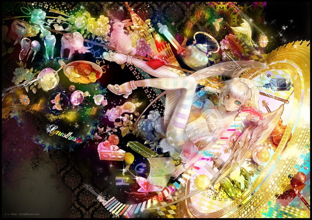
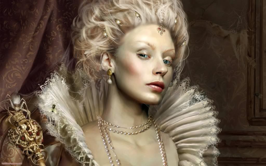
@ The old tag - Its nice, but there really isn't any transition from the background to the focal. You need to make the render/focal blend more into the tag, so it doesn't look like it was just posted on the background.
I like the first version of the candy icons better, cause the text seems kind of forced in the second version (At least in the first and second icon of that set, the third one seems ok) >__<"
The stand-alone icon on top is cute, but again the text seems forced!
@ The old tag - Its nice, but there really isn't any transition from the background to the focal. You need to make the render/focal blend more into the tag, so it doesn't look like it was just posted on the background.
Again, all I can say is text >__<"
If you can't get it to work, just don't put it. Try experimenting with different colors when your using text, cause it appears your positioning is fine, but the pure black on that background isn't going to work.
I like what you did with the colors, its clearly more interesting then the original, so good work there :3
Only problem I have with the background is the rose you put on multiply/difference (one of those settings) on the right side of the tag, it just sticks out as odd to me. Either blur the original layer with the rose it so the details are lost (and it will blend better), or lower the opacity so it doesn't stick out as much. Either way should allow you to keep the color streaks, but make them less noticeable
Overall good work though, its a clear improvement from the last tag I saw~
[quote name='Lulu']@MW, I know about the stand alone >_>' I was just lazy xD
I'll try to fix the candy ones tho ~
TY ~
@Rah, *rapes back*
And more update ._.
 [/QUOTE]
I always despise text but I guess I'll have to make do with it since most people always CnC text than the real piece itself. Seriously, people, if you love text that much, I suggest you should make a typo-only tag instead of tags like this. =_=
Now for the CnC. The colors are interesting but it is way to common for my taste. The blurring is good. Seriously, I don't want to be rude but some people can achieve this output in just 10 layers. =_=
You're doing so hard for your tags yet the output remains simple. Experiment more. There are lots of things that you can experiment with(e.g. render it and give it a whole new BG or look).
Text, no comment, let the other professional typography artists there CnC it. /sarcasm
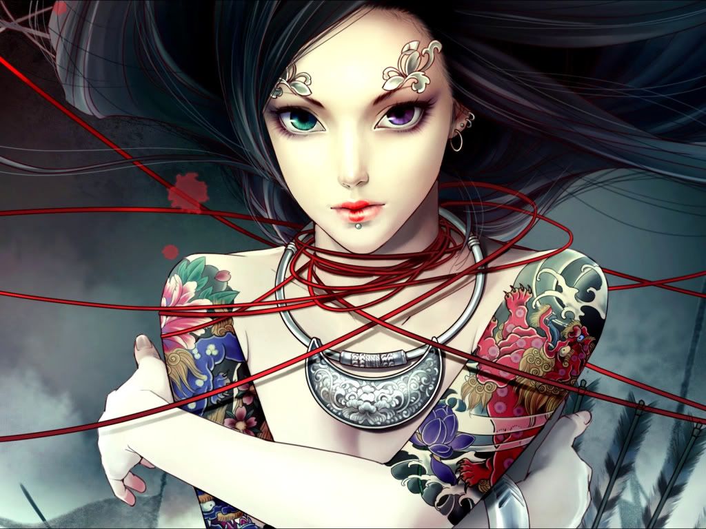
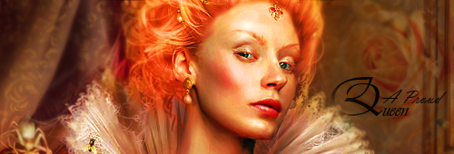
Tip: Add more effects. The proud queen doesn't look to much proud to me.
P.S. It's so boring to CnC too much as well because it seems that most GFXers here are way to focused on text. =_=
Text FTW. OTL
I'll try to fix the candy ones tho ~
TY ~
@Rah, *rapes back*
And more update ._.
I always despise text but I guess I'll have to make do with it since most people always CnC text than the real piece itself. Seriously, people, if you love text that much, I suggest you should make a typo-only tag instead of tags like this. =_=
Now for the CnC. The colors are interesting but it is way to common for my taste. The blurring is good. Seriously, I don't want to be rude but some people can achieve this output in just 10 layers. =_=
You're doing so hard for your tags yet the output remains simple. Experiment more. There are lots of things that you can experiment with(e.g. render it and give it a whole new BG or look).
Text, no comment, let the other professional typography artists there CnC it. /sarcasm
Tip: Add more effects. The proud queen doesn't look to much proud to me.
P.S. It's so boring to CnC too much as well because it seems that most GFXers here are way to focused on text. =_=
Text FTW. OTL