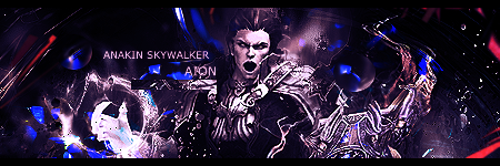
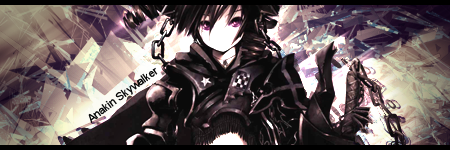
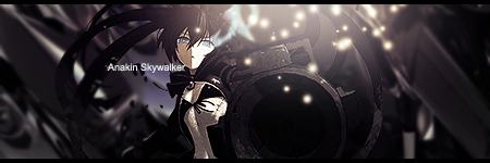
My Sigs
- Thread starter Absolutezero645
- Start date
[quote name='"CatzyLee93' date=' post: 15206"']New sigs!!Number 4 is cool! oh and number 5 is amazing too!I love the Naruto one! Good job![/quote][quote name='"Tri Edge' date=' post: 15207"']Number 7 is easily the best one yet. It's got the best flow, depth and blending out of them all, that's a step in the right direction.[/quote]Thank you~
Some nice work specially this one
 Need to try working on your texting skills~Wanna try to have the text go with the flow of the signaturesand blend in with them properly with them being some where nearthe Render/Focal point For the color/colors of the font usually best to use a color from the renderas for the color for the font.


