[quote name='Lovely.']Eh, yeah I do suck. XD I thought that the bigger ones looked like they popped out more than the smaller ones, but IDK. ><; Really shows how I do not know anything about depth.... Maybe I should just skip the next SOTW,,,
Do you have a tut or something or an image that I could see with good examples of depth? *looks hopeful* :3
------
I think I'm going to give up on depth for now. >_>
Anyways Update:

I found a tut that I actually understood.") CLICK[/QUOTE]
CLICK[/QUOTE]
I know the tut you followed. ^^
But one word. Dull.
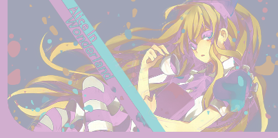
I'm gonna tell you the cons of this tag first.
It lacks the proper lighting resulting it to be dull. Much as I don't want to be rude in my CnC but it looks messy in general. You should have erased a bit of the splatter in the focal like "Excuse me. I'm a focal so can I pass through?"
You should've made the bar lines solid than lowering it's opacity.
One last thing about the cons of this kind of tag is the flow. It cuts at the bars. If you erase some splatter on the focal the first thing you'll notice is the focal. It will start there proceeding to the bottom left then BAM! Gone.
The pros of this tag. It looks quite appealing. Nice placement of the render.
General: Fix the lighting. Erase some on the focal. Since that bar thing is part of the tut. At least make the bars solid(don't lower the opacity). Since it will appear like a part of the border. lol. Try to fix the mess too. Don't spam splatter brushes so much. Consider where you drop those brushes.
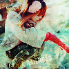
If I were the one making this, I'd really prefer to add something to make the coffee look like it's really pouring.
How can it be achieved(if you're interested)? Pick the color of the coffee>play around with the colors that are near the color that you picked>brush it to where you like(just make sure the flow of the coffee is something realistic)>play with lighten only, screen and multiply(whichever you think is best)>done.
Generally, you're pretty good. You keep on trying new styles per update and I salute you for that. ^^
What else you need to improve? Lighting, colors(ever heard of gradient maps? If yes try using them), flow, and try innovating your own style more.
P.S. Depth, is not making your tags 3dish. OTL It is the element that helps your focal become more solid. More like, it helps you to emphasize it. Because tags are divided through background, middle ground, and fore ground that's why it is called 3d(3 dimensions). Making depth is identifying those in a tag and blurring what is needed to be blurred. ^^
P.P.S. I think the tut you followed needs your tag to be monochromatic, right?
P.P.P.S. Sorry for the block of text, my dear. OTL
-Maria.
Do you have a tut or something or an image that I could see with good examples of depth? *looks hopeful* :3
------
I think I'm going to give up on depth for now. >_>
Anyways Update:
I found a tut that I actually understood.
CLICK[/QUOTE]I know the tut you followed. ^^
But one word. Dull.
I'm gonna tell you the cons of this tag first.
It lacks the proper lighting resulting it to be dull. Much as I don't want to be rude in my CnC but it looks messy in general. You should have erased a bit of the splatter in the focal like "Excuse me. I'm a focal so can I pass through?"
You should've made the bar lines solid than lowering it's opacity.
One last thing about the cons of this kind of tag is the flow. It cuts at the bars. If you erase some splatter on the focal the first thing you'll notice is the focal. It will start there proceeding to the bottom left then BAM! Gone.
The pros of this tag. It looks quite appealing. Nice placement of the render.
General: Fix the lighting. Erase some on the focal. Since that bar thing is part of the tut. At least make the bars solid(don't lower the opacity). Since it will appear like a part of the border. lol. Try to fix the mess too. Don't spam splatter brushes so much. Consider where you drop those brushes.
If I were the one making this, I'd really prefer to add something to make the coffee look like it's really pouring.
How can it be achieved(if you're interested)? Pick the color of the coffee>play around with the colors that are near the color that you picked>brush it to where you like(just make sure the flow of the coffee is something realistic)>play with lighten only, screen and multiply(whichever you think is best)>done.
Generally, you're pretty good. You keep on trying new styles per update and I salute you for that. ^^
What else you need to improve? Lighting, colors(ever heard of gradient maps? If yes try using them), flow, and try innovating your own style more.
P.S. Depth, is not making your tags 3dish. OTL It is the element that helps your focal become more solid. More like, it helps you to emphasize it. Because tags are divided through background, middle ground, and fore ground that's why it is called 3d(3 dimensions). Making depth is identifying those in a tag and blurring what is needed to be blurred. ^^
P.P.S. I think the tut you followed needs your tag to be monochromatic, right?
P.P.P.S. Sorry for the block of text, my dear. OTL
-Maria.