Liliac's GFX Garden~

Maria.

→Donut Vampire
#21
[quote name='Lovely.']Eh, yeah I do suck. XD I thought that the bigger ones looked like they popped out more than the smaller ones, but IDK. ><; Really shows how I do not know anything about depth.... Maybe I should just skip the next SOTW,,,


Do you have a tut or something or an image that I could see with good examples of depth? *looks hopeful* :3


------

I think I'm going to give up on depth for now. >_>


Anyways Update:
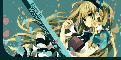


I found a tut that I actually understood.:) CLICK[/QUOTE]


I know the tut you followed. ^^

But one word. Dull.

I'm gonna tell you the cons of this tag first.

It lacks the proper lighting resulting it to be dull. Much as I don't want to be rude in my CnC but it looks messy in general. You should have erased a bit of the splatter in the focal like "Excuse me. I'm a focal so can I pass through?"

You should've made the bar lines solid than lowering it's opacity.

One last thing about the cons of this kind of tag is the flow. It cuts at the bars. If you erase some splatter on the focal the first thing you'll notice is the focal. It will start there proceeding to the bottom left then BAM! Gone.

The pros of this tag. It looks quite appealing. Nice placement of the render.

General: Fix the lighting. Erase some on the focal. Since that bar thing is part of the tut. At least make the bars solid(don't lower the opacity). Since it will appear like a part of the border. lol. Try to fix the mess too. Don't spam splatter brushes so much. Consider where you drop those brushes.

If I were the one making this, I'd really prefer to add something to make the coffee look like it's really pouring.

How can it be achieved(if you're interested)? Pick the color of the coffee>play around with the colors that are near the color that you picked>brush it to where you like(just make sure the flow of the coffee is something realistic)>play with lighten only, screen and multiply(whichever you think is best)>done.


Generally, you're pretty good. You keep on trying new styles per update and I salute you for that. ^^

What else you need to improve? Lighting, colors(ever heard of gradient maps? If yes try using them), flow, and try innovating your own style more.


P.S. Depth, is not making your tags 3dish. OTL It is the element that helps your focal become more solid. More like, it helps you to emphasize it. Because tags are divided through background, middle ground, and fore ground that's why it is called 3d(3 dimensions). Making depth is identifying those in a tag and blurring what is needed to be blurred. ^^


P.P.S. I think the tut you followed needs your tag to be monochromatic, right?


P.P.P.S. Sorry for the block of text, my dear. OTL


-Maria.
 
#22
Yay CnC♥ I'm not good with lighting... ><; Haven't really explored that yet, OTL, I know I need to.... Ok, I'll do that, and get rid of some of the brushes.... The reason why I put so many was because I was afraid that it would look.... empty if I didn't.. The flow, yeah, I noticed that too... Not sure what to do with it though... Maybe I should get rid of it... but what would I do you suggest that I do with the emptiness that's left over? That's a good idea though, making the coffee look like it would pour out, more realistic... I'll have to do that... Thanks a lot for that tip, but it's going to take me a while to figure out... ;___; And yep, i like to try new things.. And experiment,, though I'm not that good. LOL. Gradient maps, just started playing with them, I need to find tuts that will help...

Depth I see, I'll have to try that on my next update. XD

And yes, it is supposed to be monochromatic... But I wanted to see what it would do with something else, OTL..... I'll try to find something monochromatic and try the tut again. :D

And it's fine, thanks for taking your time and actually CnCing that much! :3


P.S. Sorry for my block of text... >_>


Ok so I tried out what you said, getting rid of some of the splatters and not lowering the opacity of the bars,, then I tried deleteing the bars out to help the flow... Other than that I didn't do anything.... Not enough time, ,, I'lll try the coffee thing next time...


Maria.
→Donut Vampire
#23
[quote name='Lovely.']Yay CnC♥ I'm not good with lighting... ><; Haven't really explored that yet, OTL, I know I need to.... Ok, I'll do that, and get rid of some of the brushes.... The reason why I put so many was because I was afraid that it would look.... empty if I didn't.. The flow, yeah, I noticed that too... Not sure what to do with it though... Maybe I should get rid of it... but what would I do you suggest that I do with the emptiness that's left over? That's a good idea though, making the coffee look like it would pour out, more realistic... I'll have to do that... Thanks a lot for that tip, but it's going to take me a while to figure out... ;___; And yep, i like to try new things.. And experiment,, though I'm not that good. LOL. Gradient maps, just started playing with them, I need to find tuts that will help...

Depth I see, I'll have to try that on my next update. XD

And yes, it is supposed to be monochromatic... But I wanted to see what it would do with something else, OTL..... I'll try to find something monochromatic and try the tut again. :D

And it's fine, thanks for taking your time and actually CnCing that much! :3


P.S. Sorry for my block of text... >_>


Ok so I tried out what you said, getting rid of some of the splatters and not lowering the opacity of the bars,, then I tried deleteing the bars out to help the flow... Other than that I didn't do anything.... Not enough time, ,, I'lll try the coffee thing next time...


[/QUOTE]


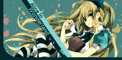
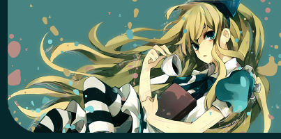
I like the v1 better. v2 looks empty without the text.

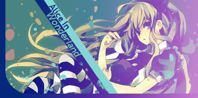
Well, I'm not exactly saying that you remove the text. It is part of the tut so you can't do anything about it. Since you just followed it and tried to be more innovative by not making it monochromatic. But nice rework. I really like it. I think try to be more innovative in the colors, I think. This blue is dull. Try placing a pink touch to this. It'd look good.

Royal Blue/Light Pink>Gradient Map>Set to Lighten only(to soften the tag coz it looks so rough)

Wew. I think this is the first thread here I commented that I'm sharing my own styles and techniques to you. lawl. Well, maybe coz I see so much of myself in your works that's why I get carried away in commenting. Try more styles, you got the skills and talent. Just practice more. ^^
 
#24
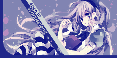
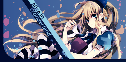
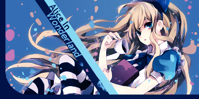
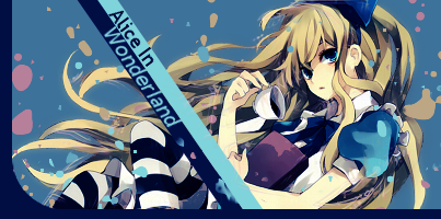
Oh, ok, and thanks! I'm glad I got a few things right! :3 I see what you mean, I did as you said, and the colors were much better!♥ I was a bit confused but I guessed that you meant that royal blue is the foreground and light pink is the background? Then take the .png image copy it, and then go to colors -> map -> gradient map? Then set to lighten only? Or do you want me to do it on a new layer and just up a gradient map on it and then lighten only... Or did you mean that the royal blue and light pink on a diff map? Sorry, so many questions.... And even though I've been doing this for 2months I'm still a newb... >_> Anyways, I did all sorts of ways, kinda confused, but when I put it on lighten only it went weird so I just used diff settings? IDK... ><;; Sorry.... But here, I'll just post the many versions I made so you can see?


This is what happened when set to lighten only... I think it happened because I wasn't sure what I was doing...


When I tried diff settings:


I still haven't done the coffee thing yet... but i will! eventually... >_> School is a killer.... ;_____; And thanks soooo very much for the CnC! :3 I appreciate it a lot, also thanks for the helping me out with ur techniques!♥ I will practice more... and hopefully find a way to keep my gimp....
 

Maria.
→Donut Vampire
#26
This is right:


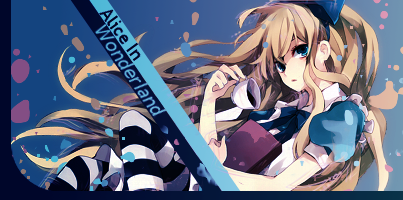
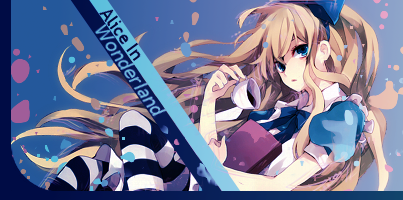
The whole thing about the gradient maps>Lighten only is to give your tags that special softness. You see, I noticed in your tags that it is sharp yet you pull soft types of concepts. Try lowering the opacity to 10-30%. Just to give that soft feel to our cute Alice. ^^
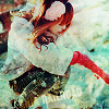


I'll CnC the SOTW entry. Question: WHAT DID YOU DO WITH THIS TAG? o_O

It is pretty. But I don't know what's with this vintagish feel in it. It's like a ragged yugioh card pull out of somewhere-kind of thing. Here we go again, you always pull sharp and strong colors on a stock/render like that. Soften it. Try putting lighter colors. If possible go with lighter colors for now. Because you overdo the strong colors so much that it looks over saturated, over sharpened, and the flow looks stiff.

I'd want to see more of pieces like this from you in the future.
 
#27
Ok, I'll do that, had to take a break first.... :p

Well here's the original so you can compare it...: http://e-shuushuu.net/images/2011-04-05-390745.jpeg

Ok, I see.... Haha, I've noticed that too.... It's just that sometimes I feel like doing overstaturated stuff, OTL. But the reason why I had the entry look like that was because I wanted it too look more scared? Because, IMO, the original was too light and not scary. ><;

I'll start doing things like that from now on.... But today's update will be different....


is is something else, IDK, hope someone can CnC♥


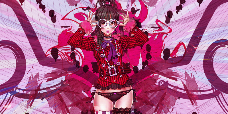
(Render not by me) Did a lot of photo-manipulation with it... Doing this like how I used to do, add a million stocks and change it too meet my needs to replace the brushes and etc that I can't get....


Edit: (version with a face)


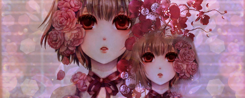
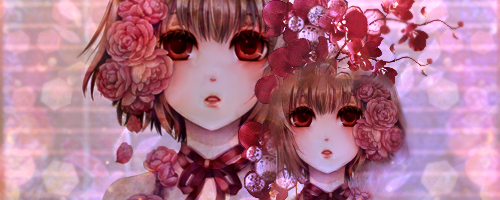
Edit: Just cause I'm 'super productive' I made a new banner...

]
 

Lovely.

Hiatus-Land
#31
[MENTION=393]Hiroto[/MENTION]: Thx for the CnC!:)


------


Blah Update:

(basically an update with stuff I NEVER finished.... >_> I'm probably not going to GFX anymore, not that I have the time, so yeah...Most are half-assed stuff... YOU'VE BEEN WARNED)


#35
@Aker & Ryu: Thx for the comments! <3 It's good to know that this thread isn't too dead, lol. XD


Update from like foreverago:


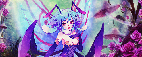
To tell the truth, IDK, what I was doing, I was trying to make something like a person's tag that I liked... but it turned out weird, lol. XD


Edit: And the SOTW entry...


Yes, I know I should have added a light source, got lazy, and when I did try it looked ugleh! D:


Anyhoo, CnC plz! <333