Gene's sigs
- Thread starter Gene Starwind
- Start date


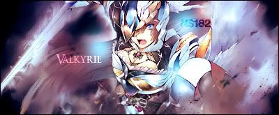


Valkyrie is nice but I've got some gripes with it. It would have been enough with just the "Valkyrie" text but what you put up on the upper right is distracting. Having text that far apart in a traditional tag is usually a bad idea. However, what you could do to kick the signature up a notch is to intensify the colors. It's not monotone but the colors don't stand out, it's almost too easy on the eyes and as a result, you lost some impact.