Hadriel's GFX Gallery
- Thread starter Hadriel
- Start date
[quote name='Hadriel']Update!
It's Tsunday, so I made a Tsunday set!


Original Stock: http://i53.tinypic.com/2vsrk15.jpg
I tried to go for a retro feel with this. I used some white retro circle brushes on a purple background, then decreased opacity a bit. I also found that nice retro font (PT Banana Split) to use.
CnC please?
[/QUOTE]
CnC consists of typo draws too much attention(unless your trying to get us to look at ruri's ass, then its kinda working) and why are there shadows when there's no recognizable light source or lighting?
The render looks very much pasted on.
may or may not elaborate on this CnC.
It's Tsunday, so I made a Tsunday set!
Original Stock: http://i53.tinypic.com/2vsrk15.jpg
I tried to go for a retro feel with this. I used some white retro circle brushes on a purple background, then decreased opacity a bit. I also found that nice retro font (PT Banana Split) to use.
CnC please?
[/QUOTE]
CnC consists of typo draws too much attention(unless your trying to get us to look at ruri's ass, then its kinda working) and why are there shadows when there's no recognizable light source or lighting?
The render looks very much pasted on.
may or may not elaborate on this CnC.
New sig!

Well, actually it's a fix of the previous one. Great thanks to [MENTION=2]Emeralda[/MENTION] for helping me improve on it!
Stock: http://i51.tinypic.com/15695z6.png
Well, actually it's a fix of the previous one. Great thanks to [MENTION=2]Emeralda[/MENTION] for helping me improve on it!
Stock: http://i51.tinypic.com/15695z6.png

Rawr, I've got some updates!
Deadpool sig! This was my first time trying the tilt-shift effect (or whatever it's called).

Original Stock: http://i56.tinypic.com/2yo7myw.jpg
And another Touhou sig!

Original Stock: http://i53.tinypic.com/14sjos3.jpg
And let's see....
*pulls out coffin*
*rummages through contents*
This was the very very very first sig I ever created, around seven months ago.

Well, lol.
Deadpool sig! This was my first time trying the tilt-shift effect (or whatever it's called).
Original Stock: http://i56.tinypic.com/2yo7myw.jpg
And another Touhou sig!
Original Stock: http://i53.tinypic.com/14sjos3.jpg
And let's see....
*pulls out coffin*
*rummages through contents*
This was the very very very first sig I ever created, around seven months ago.
Well, lol.
Moar updates!
Here's a bunch of icons I did for Aker. It was my first time making icons, actually.

Stocks:
http://vyrilien.deviantart.com/gallery/#/d1kendd
http://vyrilien.deviantart.com/gallery/#/d17pj2m
http://vyrilien.deviantart.com/gallery/#/d19cjx0
http://vyrilien.deviantart.com/gallery/#/d18f8ho
http://vyrilien.deviantart.com/gallery/#/d1l0bah
I've realized that they're actually pretty interesting to make, because placement comes in very crucially for icons.
Also, here's my entry for the ninth SOTW (Theme: Symmetry):

Render:
http://i54.tinypic.com/34qwyux.png
I don't understand why people thought that I used another image for the background. I thought the waves would have made it pretty obvious (since they're one of the most popular wave cliparts around). Actually, the entire background was arranged by me. I just took some palm tree clipart and some wave clipart and put them there. Then, I drew the line across the middle for the shorline, and then coloured the whole thing in. Pretty interesting work, since I usually work with stocks, not render+background.
And finally, here's this thing I churned out in like half an hour:

Stock:
http://i53.tinypic.com/2hmlzwm.png
It's not meant to be graphically astounding or anything, but I thought the scene (from Bakemonogatari) was awesome, so I just cropped it, added contrasts, masked the eyes and added glow to them, added some lighting effects, then spammed more contrasts. I think it turned out pretty nice, except for those two light spots on her cheeks (overcontrast, lol). I'll fix them soon.
Here's a bunch of icons I did for Aker. It was my first time making icons, actually.
Stocks:
http://vyrilien.deviantart.com/gallery/#/d1kendd
http://vyrilien.deviantart.com/gallery/#/d17pj2m
http://vyrilien.deviantart.com/gallery/#/d19cjx0
http://vyrilien.deviantart.com/gallery/#/d18f8ho
http://vyrilien.deviantart.com/gallery/#/d1l0bah
I've realized that they're actually pretty interesting to make, because placement comes in very crucially for icons.
Also, here's my entry for the ninth SOTW (Theme: Symmetry):
Render:
http://i54.tinypic.com/34qwyux.png
I don't understand why people thought that I used another image for the background. I thought the waves would have made it pretty obvious (since they're one of the most popular wave cliparts around). Actually, the entire background was arranged by me. I just took some palm tree clipart and some wave clipart and put them there. Then, I drew the line across the middle for the shorline, and then coloured the whole thing in. Pretty interesting work, since I usually work with stocks, not render+background.
And finally, here's this thing I churned out in like half an hour:
Stock:
http://i53.tinypic.com/2hmlzwm.png
It's not meant to be graphically astounding or anything, but I thought the scene (from Bakemonogatari) was awesome, so I just cropped it, added contrasts, masked the eyes and added glow to them, added some lighting effects, then spammed more contrasts. I think it turned out pretty nice, except for those two light spots on her cheeks (overcontrast, lol). I'll fix them soon.
I should really praise you for a nice sense of lighting in your works. Though, like any other GFXer you seem to go overboard sometimes.
-2nd tag
Though I found your concept of arranging your own background really amusing. Though I suggest you do color adjustments on that BG itself since most anime tends to stay on the pastel shades of colors wherein clip arts stay on the 32-bit color because of that, your render appears to be a bit pasted. The whole tag may look solid and flat but adding a speck of lighting will help to top up that tag. I'm not really also that fond of borders like that. I think, even though it is your style, it is high time for you to give up on overlay borders and start making tags with the horizontal border style or no-borders since some borders tend to cut the general flow of the tag because sometimes, a GFXer not knowingly, cuts something that is important for the flow of the tag.
-1st tag
2) Looking at it again, the render does seem to be pasted on, due to the difference in coloring in the background (gradients vs normal colors). And the border was taught to me by Emmie, and I know that soon I'll have to start finding new ways to make borders.
Thanks for the helpful CnC! :coolgrin:

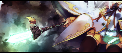
if i can... the Kara no kyoukai sig on the first page , is really cool.
And the "Yellow eyes" are a bit too yellow, I mean they are too much "briliant/shiny/present" in comparaison with the color set of the sig. It's just my opinion... nothing bad...
And the "Yellow eyes" are a bit too yellow, I mean they are too much "briliant/shiny/present" in comparaison with the color set of the sig. It's just my opinion... nothing bad...
Yooo. I thought I'd drop my SOTW entries here for posterity.
SOTW #19: Two Colours

Highly difficult to create. I was concerned that voters would be concerned about whether the entry had exactly two colours or not, so I tried as best as I could to stick to only two colours. As evidenced by darky's sig, though, it's more a question of whether the sig looks nice, not whether it fits the theme exactly. Gotta work on that. Still, two-colour sigs probably aren't my thing for now.
SOTW #20: Touhou

Not sure about this one. I was trying to mix a few new effects I'd been trying out, namely, emphasis on the focal through blurring and desaturating everything around it. The swirly brushes were overdone, I must admit. I've sworn off stocks ever since.
SOTW #21: Angels & Demons

Tried another new style for this one, that is, smudging. I'm still pretty rough at it, and I'm not really satisfied with the result here, but the only way I can go is up.
Also, if anyone has any tips or tutorials on how to blend renders in with a background, please do help. :*blush:
SOTW #19: Two Colours
Highly difficult to create. I was concerned that voters would be concerned about whether the entry had exactly two colours or not, so I tried as best as I could to stick to only two colours. As evidenced by darky's sig, though, it's more a question of whether the sig looks nice, not whether it fits the theme exactly. Gotta work on that. Still, two-colour sigs probably aren't my thing for now.
SOTW #20: Touhou
Not sure about this one. I was trying to mix a few new effects I'd been trying out, namely, emphasis on the focal through blurring and desaturating everything around it. The swirly brushes were overdone, I must admit. I've sworn off stocks ever since.
SOTW #21: Angels & Demons
Tried another new style for this one, that is, smudging. I'm still pretty rough at it, and I'm not really satisfied with the result here, but the only way I can go is up.
Also, if anyone has any tips or tutorials on how to blend renders in with a background, please do help. :*blush:
Tag 1: Actually, it doesn't look bad at all, except for being too saturated. I was kind of worried too whether my tag had only two colours or not. And I had like 20+ layers of colour adjustments. Pfft. And yeah, people usually look over how good the tag is rather than whether it follows the theme or not.
Tag 2: You've grasp the skills of depth and lighting. Though your tag is too blurry and indeed, the swirly brushes are too much.
Tag 3: Your smudging skill isn't that bad. The only thing is that your render seems to be copied and pasted in there therefore it doesn't blend with the background well. And again, no depth. :I
Tag 3: Your smudging skill isn't that bad. The only thing is that your render seems to be copied and pasted in there therefore it doesn't blend with the background well. And again, no depth. :I
I'm not really sure how to create depth in smudge signatures, because I always percerived depth to only work in signatures with non-abstract backgrounds. Can you help me out?
Apparently, it goes the same with other kind of tags. Smudges are just like side focal, most of the time though.
Like this one
I know it doesn't really look that good but it does have depth. As you can see, the smudges are just backgrounds so yeah.
However, your tag is slightly different from the tag above, seeing that the smudged wings are a part of your focal. In this case, you could of sharpened the wings and blurred the rest in the bg. But do take note that since your focal is actually derived from the center, you have to apply your sharpening in the center with the sides blurred.
Which in conclusion, all you have to do is 1. Sharpen your render. 2. In the bg, sharpen the wings. 3. Blur your overall tag starting from the sides. 4. Add some lighting to further your depth.
Sorry if you find it hard to understand. My explanation sucks. xD;