Stairway to Heaven
- Thread starter Rascal
- Start date


@ Recent Update:
Avatar - its alright, but the effects feel shallow. The coloring + the way they fade on his back just make they stick out too much for my liking. Not a fan of the icon block, but I'm assuming that was requested by someone so its not a big deal.
First Tag - Better style choice here then the ava and you did a much better job getting that icon to be part of the tag. Good idea and good job making it work. Only problem I have here is the text since its just randomly thrown in there and doesn't really fit with the tag. Overall (the whole tag) its simple, but it works.
Second Tag - The snow tag is interesting and I like how you did it, but I think you should blur the other parts of the tag to help focus the attention on the text as a focal point. But interesting idea and cool design for it.


you should avoid making sigs with 2 people and if you do they need to be together like huggin each other because the eye needs focus and it is just annoyin when the eyes play ping pong from the left to the right ") but in your case its not that bad because you lowered the opacity
but in your case its not that bad because you lowered the opacity
you should read some tutorials on deviantart too you will get better in no time and if you need help feel free to ask me if you want i can even sent you some PSD files
thats it
~Flupser
but in your case its not that bad because you lowered the opacity you should read some tutorials on deviantart too you will get better in no time and if you need help feel free to ask me
if you want i can even sent you some PSD files thats it
~Flupser
Update :T
original: [SPOILERA]http://static.zerochan.net/full/34/19/298484.jpg ... cuz IMG tags arent working[/SPOILERA]


original: [SPOILERA]http://static.zerochan.net/full/34/19/298484.jpg ... cuz IMG tags arent working[/SPOILERA]


I moved it here, LMAO~
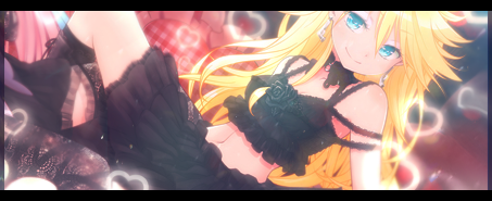
Pretty sig is pretty. :3 Ok, I'll try to CnC~
I like how you combined the 2 images into one sig~
But the light does ruin the focus... ><; And the guy seems a bit pasted...more blending?
the difference between the two bg's of the sig irks me for some reason, it might just be me though. :3
The text is cool, but makes it not look like a sig.... more tagish~ (does that even make any sense at all, OTL?)
But overall the sig is aesthetically appealing and is cool, it's one of ur bests~ xD
For the avy, it's a bit big, and the border seems a bit too big, but I"m not one for border so~ xD The text on the avy is a bit too big, distracts from focal, but ish cool :3
ugh avatars... i never do them right x.x i dont even attempt because so little space confuses me
he does look pasted.... i tried to kinda blur the edges... but it only looked pasted with blurred edges lol ... how would i blend it in? what if i put a drop shadow to make him stand out more instead of blending in more...
he does look pasted.... i tried to kinda blur the edges... but it only looked pasted with blurred edges lol ... how would i blend it in? what if i put a drop shadow to make him stand out more instead of blending in more...
Um, well my way of doing it uses a bunch of layers, so bear with me. xD
I get my render and duplicate it a couple of times. But get only one layer to be visable, take that layer and go to Filters-->Blur-->Gaussian blur (set the blur to 10)
Now get another layer of the render and put it on the one that was blurred.... If it looks good, then keep it like that, and ur done~
If it's still pasted looking then take that render and smudge the edges of the render.. Then get another layer of the render and put it on top of that, now take the render layer that u just smudged and set it to screen,multiply, whatever looks good, and sometimes u might want to change the opacity just a bit...
And if that still doesn't work you can take topmost render layer and blur the edges a bit, not a lot, just a bit. Oh and u might want to blur the bg where the render and it meet. So that it looks like the bg and render are together. :3
And that's what I do to my renders. Sometimes I leave out a few steps, sometimes I do some more gaussian blur layers at settings of 10+, it all depends on the render and bg, but that's how I usually do it! Hope it helps~ xD (and hope it makes sense. LMAO)
(btw this is from GIMP, so if u use ps it's probably the same aspect, just a bit different...)


