Prince's Awsumires ~!
- Thread starter Prince
- Start date

Prince presents hes latest project titles the " Crimson Princess" , ENJOY ~! ^u^
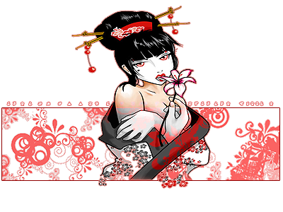
I suppose scaling the render a bit more down would help her not look squished.
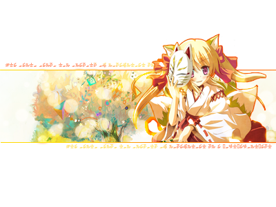
as where on this one^ she looks normaly portioned
")
Personally for me, I don't like the orange outer stroke (Crimson Princess) because I don't like what it does to the chopsticks in her hair
but other then that, I think it looks nice.I haven't delved much into pop out sigs, only made one once and it was basic
that will have to be my next project