Prince's Awsumires ~!

Prince

Earth's Blessing
Staff member
#1
Greetings and Welcome to Prince's Portfolio
where Prince's awsumires is dispalyed
so that anyone can have
a chance to
enjoy it ~!
>w<
About Prince's gfx history :
I started Gfx about 3 , 3 and a half years ago maybe more ~! At first it wasn't much , since I was only interested in digital editing and such , but later while i was visiting forums here and there , i stared to get interested in other things such as sigs and later even wallpapers~!
Even though my sigs suck from time to time , or my skills aren't awsome , i always try to put 100% in the things i make while still having a look of simplicity so that even people who don't understand gfx can appreciate them ^w^ ~!
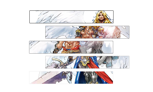
And now here are some of the sigs that i collected through out the years , starting from the ever first one i made ... TuT *sniff sniff* such a touchy moment ...
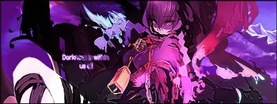
These are some that i made during the first time i participated in the SOTW​
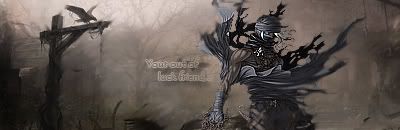
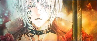
This happens to be one of my favorites >w<​
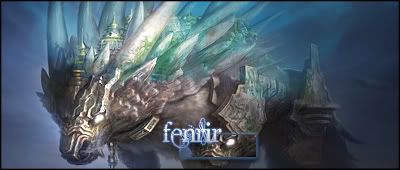
Some more SOTW signatures >w>​
Part 2 :​
And dis i part 3 including some of the newest signatures :​
Well , this is all from me for now , untill my latest creations come to life ~!
Bwahahaha *cough cough*
 

Prince

Earth's Blessing
Staff member
#3
Yeah that one ...had a really hard time with that one , had to do it like over and over and over untill i got it right >.<
 

Darkchao45

No More Heroes
Staff member
#4
[quote name='"Prince' date=' post: 43907"']
[/quote]I really liked this one. Overall your sigs are top notch. There's definitely and improvement from your first sigs to your more latest ones.
 

Prince

Earth's Blessing
Staff member
#8
Yeah , your right , it needs a little bit more blending around the wings , but it kinda ruined the balance with the rest of the parts so i left them like that for now ...Thank you , CnC is allways appreciated
 

:sachiko:

~*~ cookie keeper ~*~
#15
the one in pieces is really nice ouo and the purple on its good too o; nice focus on the girl >u< and at the other one with the girl u could've sharpenned her eyes ¬.¬
 

Asch

Administrator
Staff member
#16
I like this one, although, in most of the sigs I have noticed that the the height x width ratio is distorted, kinda making the render look stretched. Overall, you should work on placement as of now.P.S. I seriously like this one
 

Prince

Earth's Blessing
Staff member
#17
Thank you all for the CnC and for your time~!I shallz try to improve as much as I can ~!Until then enjoy looking around ~! ^u^(Asch I don't get the distorted proportions thingy , I always use a standard 400x150 size @.@)
 

dark_9tails

dark_9tailsノ(ಥ益ಥノ)
#19
Pop out tags are really hard to work with when it comes to depth and yep, your pop out tags lack of it. Your other tags aren't that bad too, but most of them are of low quality. And some of your tags in your first post; although they do have depth, it's like you forced them into having depths by over-blurring the sides.


This actually looks good in terms of colours and effects. I like the pentooling effects in there. But again, you need to work on the quality. A bit of blurring on the sides and sharpening in your render would make it look better.
 

Prince

Earth's Blessing
Staff member
#20
Thank you for the time and CnC
Your right Dark, the sigs at the begging are messy,because I was doing allot of experimenting >.<
I still have allot to learn, and the path of gfx is full of Error, Photoshop Not Responding and System has Crashed xD