GFXer's Corner

VivaLaDementia

Yea, Its been a ride...


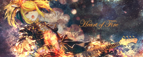
Pretty monotone, it kind of ruins the tag for me. The effects look like they would be decent/good if there was some color variety, but they all just kind of blend together to nothing when all the colors are the same color like that. The text placement is good, but the faded-ness kind of is a turnoff as well.


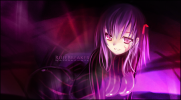
My favorite of the 3, since there is some color variety + background detail. The text seems kind of pointless here, either make it have more of an impact or get rid of it.

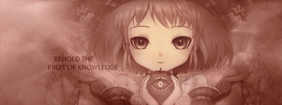
It seems LQ by the lower left side though >__<"

Try adding blur effects to make the background appear more errr Mystical? I think it will fit a lot better that way.


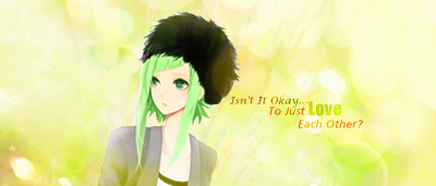
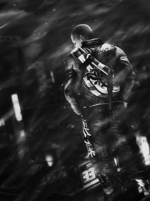
Not monotone, which is good, but the background is still just a big blur here. No real details makes the tag just look like some text plus a person.

Try making the background have more details and make the details clear. That should help pull the tag together. Maybe try to put the text a bit lower + closer to the focal as well? Not sure, but I think it could work better.
 
I'll try to CnC...

The 1st one is pretty good, but being monotone kinda killed it.... If it was in color it would be awesome. :3

The 2nd is the best of the 3, there's just so much negative space....

The 3rd is really empty... More effects or something to help?


Sorry I fail at CnC... ><'
 
Hmm, i see the, the first tag is too monotone... the color balance was pretty off before i made it monotone, but i guess i just took the lazy way out. Seems it really takes some skill to pull of monotone tags. Hmm i didnt really notice the fadedness of the text, i'll fix up this tag since you guy say it has good potential.


too much negative space for the 2nd one eh? I'll see what can be done(not much i believe, i'll still work on it, because im determined!)


and the third is really crippled by negative space, i'll give up on it...


Thx for the CnC guys, that'll be all i need. Any additional CnCs will be welcome though.
 
The 3rd one, you could probably save it... Just put another bg on it..... Like of a forest or something... something that matches the theme that you're trying to get at.... I usually do that... Then you could blur it and stuff and add depth, and if you liked the old bg as it is, just put the new one behind that... And it might help? :3
 
*levitatesabovemine*

Ok, I'll try to CnC, forgive me if I fail....

First a question, are they renders? Because for some reason the seem pasted? Mostly the guy though....


Anyways, the avy for the guy is ok, it's simple, but looks pasted? For the girl, she looks better, but that pink blob there is quite annoying... It takes my attention away and seems really out of place, destroying it for me...

The sig/tag is a bit too tall... But it's ur choice to crop it or not.... I like the lighting u put on it. The effects are nice though, it's not too much, it's pretty simple and clean. But the light that is on the bottom right is wayy to easy to see, doesn't really look light light anymore, more like something white that slashed across her hair....The lighting above her hair too.....


Other than that it's good.... :3 (otl sorry for the block of text and any misspellings...)
 

godofwar7

Active Member
I disagree and say it does not look very good.


Despite you showing their to be a bright light source, the tag seems dull and darkish, colorwise. brighten or lighten, your choice.

Normally pink effects normally work very well with pink haired girls as the focal, but in this case euphemia is not the sole focal, so in fact the pink effects are messing with the color scheme of the tag, you can thank suzaku for that.

Furthermore there seems to be no point to the effects, as it worsens the tag instead of betters it. Just seems random.

Typography is bad. the rounded font does not suit the tag and splitting the text apart was not a good idea. Keep them together. Besides its not like you need to have the name right next to the render for people to figure it out.

Also, yeah its too tall.

The border completely defeats the purpose of being a border. you have a light pink border that can be hardly be seen, except for at the top of suzakus head which make people go "wtf?" Borders exist to be seen in their entirety, so if youre going to do borders, its best to just stick with a simple black border.
 

VivaLaDementia

Yea, Its been a ride...
Since I'm annoyed at the forums anti-vertical signature uptight-ness, I'm posting my Infamous 2 signature here:


*raises fist to the sky and curses the gods for not letting me wear it*
 

VivaLaDementia

Yea, Its been a ride...
[quote name='Emeralda' timestamp='1307198046' post='146074']

Sigh, I think I will need to new vector sets soon. There's a limit on how long you can go on flowers alone. Any ideas?

[/quote]

More flowers? D:

Arrows? I dunno, people seem to love arrows with vectors for some reason.
 

godofwar7

Active Member
In all honesty, the render isn't blended into the tag too much. The only place it doesn't seem pasted on is next to and below the front shoulder where you placed the text.


The negative spaces stands out quite alot considering the immense amount of light sources in the tag.
 

Emeralda

Pistis Sophia
First, check her face. There's an unsightly dark something that kinda ruins the render. Try removing that from her face and a little below it.

Create a new layer, set it to soft light, take a soft brush and paint some white where the lightning should be. Repeat, but with black now.

For font, it's too fancy. Pick something simpler, clear a new layer > clipping mask > apply image > move the mask around to get a nice orange effect instead

Smaller and a simple border. To be honest, it looks like a cropped image from something as it is now.

New layer > apply image > filters > sharpen > create a vector mask and erase the background
New layer > apply image > filters > guassian blur 2px > blending to lighten, opacity to around 30%
New layer > apply image > filters > guassian blurr 2px > lower the opacity to 30% > create a vector mask and remove the area on the render
 

Emeralda

Pistis Sophia
Look at her top hair for example, you can clearly see remains of a white background or something like that. My tips? Select the background, copy it and hide the original, and use a guassian blur = 1 on the copy. Do the same for the splash effects above the render layer, but with a 0,5 setting.
 

Emeralda

Pistis Sophia
Do one more blur round for background. Get rid of the ugly text that was place there randomly, it completely doesn't fit. The lightning is also horrid, you have a really lightened render, where you see there should be a strong source of light, but the background is almost night-light. Also this: http://prntscr.com/235oj < the legs, even though the effect should be that they are in water, stick too much out, creating a weird effect.